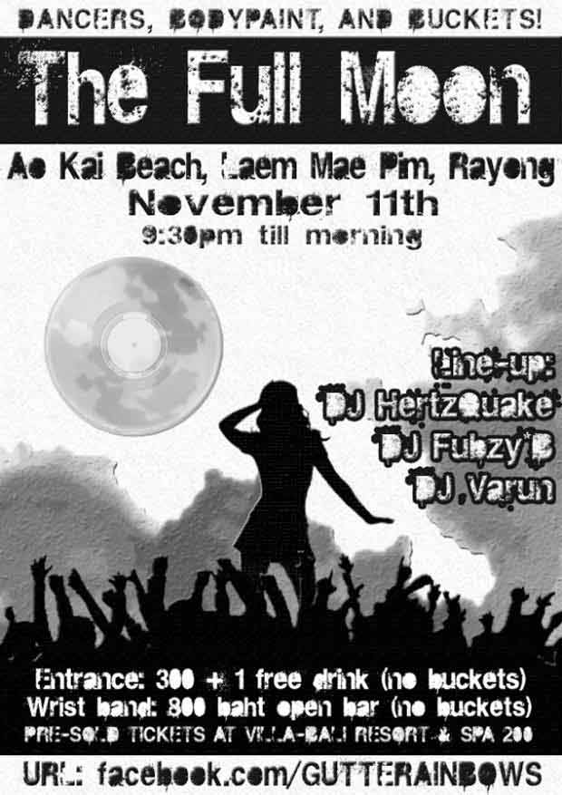
Thailand Full Moon party flyer 300 DPI graphic designed for photocopier

Black and White Graphic design for a Full moon party in Thailand. Designed using; Photoshop, stock vectors, imagination and a love for restriction… a design brief where the common photocopier is your best and only friend…
I used to design a lot like this a long time ago. When I first started designing flyers for friend’s parties, house parties, squat raves, underground club nights, gigs, rock concerts, gatherings. At the time I didn’t even have a computer to call my own! I would simply draw the poster design by hand on an appropriate sized piece of paper and then play around with the photocopier settings; tone and size to get the right results. Sometimes you can do fun stuff like putting and moving objects right on the photocopier itself. It is indeed a fine art in itself! Because your dealing with grey scale tones a lot of the colours you use on the original master art work come out looking completely different on the photocopy version.
What I’m talking about is old school, grass roots style “no money for 300DPI cmyk full colour double sided printing on 280gsm card flyer promotion”. Young people need to party and need to get their message out. Before the days of the facebook event party era and affordable pay-as-you-go mobile phones the common photocopier was the saviour for those looking to get their message out cheaply en mass… Professional digital printing was then and is now and expensive means to an end. So where the budget is tight the quirky illustrator and graphic artist can turn to the old friend the photocopier. Even compared to owning your own computer printer it is plain to see that the photocopier or Xerox machine is simply the cheapest and most efficient way to run up a stack of A6, A5, A4 or even A3 copies. The major limitation, is the colour range, colour copies are very expensive but black on white is a cheap way to have your information distributed.
Being limited to gray scale or even black and white will certainly limit you in design. But sometimes it’s possible to do more with less… Designing with restrictions can lead to breakthroughs in design…

Hand drawing a flyer and then photocopying it is cheap at cost, using a guillotine or a craft knife to slice them up… but at least there is no waiting time or dependence on arsey printer technicians…
The full moon party poster in question is quite far removed from where I originally started when designing hand drawn flyer and poster art. This image was made using Photoshop. What you see here is a whole bunch of layers being subtlety textured and augmented to produce what looks like a beach rave scene. The full moon in the background of the image is placed low in the sky and merged with a vinyl record. The poster art is completed with a silhouette of a sexy lady posing in front of a silhouetted crowd of energy driven ravers. It was designed for the mighty Gutter Rainbows party crew for a 2011 Full moon party happening in Rayong, Thailand and I had fun making it. I also performed some live painting at the full moon party details of which you can see on my page about live art event painting.
So, long story cut short it was a while since anyone asked me to design in black and white specifically for the photocopier…This full moon had the grass roots ethos and allowed me to take my design skills back to this frame of mind… Here are my top tips for anyone facing the same task (designing poster or flyer art intended for photocopy)
A guide to designing black and white or grey scale art meant reproduction on a photocopier…
- SET YOUR PHOTOSHOP FILE TO GREY SCALE OR BLACK AND WHITE! IMAGE–>MODE- Choose…Design in Black and white from the beginning. Don’t go kidding yourself that you can design a colour image and then simply switch it to grey scale mode at the end and everything will look fine, because if it does your very lucky. Be sure to accommodate shitty reproduction graphics, ink smudges and belts of black or inconsistent ink printing which comes with the territory of the photo copier. In other words design bold and brave as possible.
- If you are working with many different Photoshop layers in your file, stop every now and then to select the complete image, select COPY MERGED and paste it as a top layer. Adjust the brightness and contrast, also the levels to see how your image would fair using a lame photo copier machine, remember your design may be perfectly balanced tonally but all your effort may be ruined by a commercial grade mass photocopier…they are not renowned for accuracy or perfection!
- If you cannot do the above squint your eyes slightly, can you still read all the information on the flyer? If it’s A4 size do not make your letter any smaller than 14 point, it’s pointless…
- As with all street based promotional material be sure it’s catchy, direct and the info is well laid out. Sometimes people will have to absorb all the info in 3 seconds whilst walking or driving past the poster. So make sure the main info hits you first and the other secondary information can be observed on closer scrutiny. Walk around your screen from different angles, look away, walk out the room, walk back in side, look at your screen, can you read it from 5 meters away? If not, you should probably re-design.
- Test! Print one out and go to the local photo copy place and try a couple of settings, try to photo copy at normal settings, try at a dark or darker setting try the same with a light and lighter setting. If your artwork and all the information contained on it can still be deciphered you’re doing everything A-ok!
One final tip would be actually play around with a photocopier sometimes, get to know it’s weaknesses and strengths. Get to know how to make it do stuff it’s not supposed to, because you never know when you’ll be stuck without anything but a pen and paper in an old dusty and sleepy town without any computers let alone and internet connection for stock photos…Then it’s just you and your old friend the Xerox machine.
My own major inspiration for photocopier based creation is artist Dave McKean. He was often keen to quote the photocopier as a major aid in his production of cutting edge fantasy surreal landscapes and photo montages using real elements such as people and household objects. Also standardly, there are small “hacks” that you can employ during your photocopying process. Photocopy a document but move the paper rapidly during the scanning of the image process to produce wavy and trippy looking photo copies for example. Also who could forget firm favourite such as enlarge, reduce, literal copy and paste using real life glue paste and cutting scissors (those were not the days) give me a Abode creative sweet with Photoshop and illustrator any day. As with any argument surrounding the digital vs analogue technology as with the SLR vs. Digital SLR camera, there are small subtle analogue nuances that simply cannot be reproduced using digital graphics editing software. I digress, this is about a Full Moon party black and white graphic design meant for being reproduced on a photocopier.
I will try and dig up some of the old rave flyers i did and post them up here for a comparison to the clean image above…


